

In this article, I’ll explain my process for creating high-converting landing pages.
Here’s a table of contents:
- Consider Your Visitors’ Level Of Awareness
- Consider The Page’s Traffic Source
- Create An Irresistible Offer That Drips In Value For Your Prospect
- Make Sure You’ve Addressed These Critical Strategic Elements
- Make Sure You’ve Addressed These Critical Tactical Elements
- Follow These Guidelines When Writing Copy
- Follow These Guidelines When Crafting Layout & Design
- Follow These Guidelines When Designing Your Pop-Up Form
- Make Sure You Address Mobile Traffic
- Install Tracking Codes & Remarketing Pixels
- Create An Effective Thank You Page
- Test Your Landing Pages Repeatedly, Forever
I’m passionate about this topic for a few reasons. Firstly, most paid traffic campaigns (AdWords, Facebook, et cetera) are configured to send visitors to landing pages. An inefficient landing page means money is being wasted. Using this logic, it makes sense to optimise a landing page as much as possible. Secondly, I often come across paid traffic campaigns sending traffic to a site’s homepage. NO! Create a landing page, please – you’ll get a huge upswing in ROI. I hope, by reading this, you’ll either (a) improve the conversion power of your landing pages, or (b) create them in the first place.
Here’s my landing page creation guide you can follow to create or improve your own landing pages.
Use this guide as follows:
- If you’re starting a landing page from a blank canvas, follow this process from 1 to 12.
- If you’re auditing or updating an existing landing page, feel free to jump to any stage you like.
1. Consider Your Visitors’ Level Of Awareness
Before you begin the creation of your landing page, you’ll need to clearly understand the reader or visitor’s level of awareness around your product or service.
Advertising guy Eugene Schwartz coined the “Five Levels Of Customer Awareness” in his book Breakthrough Advertising, and they are inherently important in the landing page production process.
In a landing page context, the five levels are:
- Most Aware – Page visitors who know and love what you do. They buy your products and are loyal to your brand. Easy to sell to.
- Product Aware – Page visitors who know your product or service, but haven’t bought it. They are familiar with your competitors’ value propositions, and aren’t sure if YOU are the right choice for them just yet.
- Solution Aware – Page visitors who know what solution they are looking for, but didn’t previously know about your specific product or service.
- Problem Aware – Page visitors who know they have a problem to solve or an outcome to achieve, but don’t know how to solve it yet.
- Unaware – Page visitors who don’t know they have a problem, or don’t have an outcome they want to achieve.
The less aware your page visitors are, the MORE salesmanship and direct response collateral is required on your landing page because:
- You may need to explain the problem you’re solving, or the outcome you can provide
- You may need to explain what solutions and options the prospect has
- You may need to convince your prospects that YOU are the best solution when compared against your competitors
Generally speaking, the less aware the visitor is, the longer your landing page will need to be.
2. Consider The Page’s Traffic Source
The type of traffic arriving at your landing page will dictate the complexity and messaging required to get the best response.
Sources to consider are:
Paid vs. Non-paid
- If traffic is paid (coming from AdWords, Facebook PPC, LinkedIn, or any other paid traffic platform), you’ll have the ability to laser target which keywords or audiences will visit certain pages. This will allow you to create a seamless ad —> landing page experience by tailoring headlines, supporting text, images, production value, and overall page experience.
- If the traffic is unpaid (traffic could be from organic search, social media, or above the line), you’ll need to tailor your layout, messaging, imagery, and production value to cater for all possible search intents and audience types, regardless of their level of awareness.
Top Of Funnel vs. Middle/Bottom Of Funnel
- If traffic is brand new to your organisation or offering (the traffic is at the Top Of Funnel position), you’ll need to explain your value proposition assuming they know nothing of it whatsoever. Traffic is either Problem Aware or Solution Aware.
- If traffic is recycled, returning, or is Middle/Bottom Of Funnel (you’re in the process of nurturing them via email marketing, marketing automation or banner remarketing), you can selectively remove some of the early nurturing material you may have needed in the Top Of Funnel phase, and replace it with deeper sales tools like case studies, testimonials, and/or a closer look at the proximate and ultimate benefits of your offering. This traffic is Product Aware.
Keyword Driven, Vs. Audience Driven
- If a page is driven by keyword-centric traffic, you’ll improve the pages’s performance by specifically tailoring headlines and supporting text towards these search terms, to improve ad —> landing page relevance. Correctly executing this process will improve your page’s conversion strength (its ability to convert a visitor into a prospect) and Quality Score relevance.
- If a page is driven by audience-centric traffic (from a source like Facebook PPC or LinkedIn), you’ll need to be mindful of varying demographics and psychographics you’ve chosen to view the page. Visitors are more likely to respond to situations and images they can relate to – sending a senior citizen to a landing page containing pictures of young people might not be a strong conversion strategy. Targeting CEOs? Increase production value. Trying to persuade a younger demographic? Use energetic, inspiring imagery.
3. Create An Irresistible Offer That Drips In Value For Your Prospect
Your offer, or the item of VALUE you’ll give to the prospect, is the most important conversion element required on every landing page.
If you have a limp offer, you’ll have a limp conversion rate.
The offer on your page could be something like:
- Download a free whitepaper
- Watch a webinar
- Request a free consultation
- Book a free consultation
- Book a paid consultation
- Purchase an information product
- Purchase a tangible product
Choosing your offer depends the length and complexity of your theoretical nurturing funnel, and the prospect’s position in the funnel.
Deciding If You Need A TOFO, MOFO, and/or a BOFO?
For service industries with shorter sales cycles and low-mid average transactional value (examples are plumbers, electricians, general medical providers), a “Direct To BOFO” style of funnel should be enough to convince and convert. This means new traffic will be sent directly to an ‘Enquire Now” landing page.
For industries with longer sales cycles and higher average transactional value (examples are property, courses), a TOFO—> BOFO—> MOFO funnel will generally convince and convert more efficiently. This means new traffic will be sent to the top of the funnel: generally this is a whitepaper, checklist, buyers’ guide or piece of collateral that shows a prospect how to solve a problem on their own accord. They’ll then be nurtured “down the funnel” with automated email marketing and banner/editorial retargeting.
Choosing Offer Types:
Subsequently, the type of offer on your landing page will be influenced by the visitor’s statuses in your theoretical nurturing funnel.
Below are three different funnel stages, and associated offer characteristics.
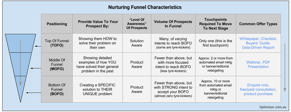
The key here is to produce an offer that drips in value for your prospect. The prospect must REALLY want to uncover the information or value you’re offering them. If this ‘sizzle’ doesn’t exist, you’ll get a lax result and the prospect will end up sniffing around your competitors.
4. Make Sure You’ve Addressed These Critical Strategic Elements
When planning, designing, refining and testing landing pages, ensure the following strategic elements have been addressed:
- Remember your landing page exists to present, justify, and SELL an offer (An offer could be a free whitepaper download, a free consultation, a sale, an appointment, or any other exchange of value). This offer should fall into a broader funnel methodology, and the landing page’s SOLE focus should be to convince visitors to execute this offer, and nothing else.
- Make sure your offer drips with jaw-dropping value. Make it irresistible. Not sure you can produce a tonne of value? Simply show your prospect how they can solve a problem they have or get an outcome they want, in a way that makes them choose YOU over your competitors. That’ll get you started.
- Ensure your offer (and subsequent sales acumen) appeals to the #1 emotional benefit that must be addressed, to convince the visitor to take action. At a high level, this is either to reduce pain or increase pleasure. There may be other emotional triggers depending on your situation.
- Make sure the landing page is seamlessly integrated into its overall traffic funnel. Generally, this means means keyword —> ad —> landing page —> thank you page relevance is logically organised.
- If the page is an AdWords landing page, make sure Quality Score has been taken into consideration. Higher Quality Score = lower average CPC.
- Getting a feel for the playing field is also a good idea. Review the landing pages of your top three competitors to see if they’re doing anything better than you, or something you might not yet be doing.
5. Make Sure You’ve Addressed These Critical Tactical Elements
Every landing page should contain the following tactical elements:
- Headline: Explaining how the offer solves the visitor’s problem, provides an outcome they desire, or presents a unique promise they can’t refuse.
- Supporting bullet points or sentence(s): Containing additional descriptors and value surrounding offer, and distinct and compelling reasons why the prospect should take action.
- Call To Action (CTA): Explaining the next logical step and a reason to act now. The CTA should also sell the value (what the prospect will get) and be worded in a manner that portrays minimal risk. A strong CTA will also explain what could happen if the prospect DOES NOT take action.
- Paragraphs: Supporting the core points of the headline and opening text. These paragraphs should play on the #1 emotional trigger of the page, and focus on a desire or fear.
- Proof points: Should be woven through the page. Examples of proof points are testimonials, data (number of clients serviced, number of members, number of units sold, etc.), memberships, accreditations, et cetera. At least one form of proof should be above the fold.
- Diagrams and value-adding imagery: Diagrams like charts and data visualisations are efficient at communicating quantitative messages, and images are essential but should not appear tacky (or “stocky”) and should not draw attention away from sales copy.
- Rich but not distracting visuals: Yes, production value is very important, but function and performance is more important than a page that looks ‘nice’.
- Lead capture form: Requesting the bare minimum amount of information required (eg. name, email address). The form should somehow reinforce the VALUE the prospect will receive when they accept the offer, and will demonstrate a concern for the prospect’s data privacy.
- Frictionless mechanics: Whereby the form should complete smoothly, and the transition to the Thank You Page should be seamless.
- Device responsive versions: So the landing page can be viewed, and is effective, on ALL mobile device sizes.
6. Follow These Guidelines When Writing Copy
Here are my landing page copy guidelines:
- Landing page copy must take your Unique Value Proposition and overlay it over the unique needs and wants of your customer – in other words, you must demonstrate how your UNIQUE offering provides an outcome your target needs, or a solution to a problem they have but don’t want. This is a sweet spot: aligning your unique offering over your customer’s needs and wants. To take this further, your copy must single out the difference between your “Market Entry” benefits and “Unique” benefits. Market Entry benefits are plain, vanilla attributes that anyone can demonstrate to enter the market. Avoid those at all costs. Unique features and benefits are what sets you apart from your competitors and should be leveraged as much as possible.
- Oh, and it goes without saying – discuss benefits, not features. Features are important, but only when describing a benefit.
- Ensure every element on the page passes the “so what” test. For example, if you tell me you have 10 years of experience, you’ll also need to explain to me how that’s going to help solve my problem or provide the outcome I’m looking for.
- Copy must provide an argument containing a choice of yeses. The more yeses the reader verbally or non-verbally says, the more likely they are to take a desired action.
- Copy must flow logically – small arguments must smoothly flow in the stream of an overall, larger argument that guides the reader into taking action.
- Copy must convince the reader that they’d be worse-off if they DID NOT take up the offer on the landing page.
- Copy must not contain a word or sentence that doesn’t provide some form of value towards the persuasion process. Every sentence should answer a “so what” test – if the sentence doesn’t relate to solving a problem or providing an outcome the prospect needs, it’s noise and should be removed.
- Use bullet points wherever and whenever you can. People don’t read online – they skim through text and scan over paragraphs. When you use bullet points, with bolding and italics, your ‘skimming’ audience will still absorb your critical sales messages.
- When you’re writing paragraphs, use short, simple sentences. And ensure every paragraph works off a desire or fear.
- Use the word “YOU” not “WE” or “I”. Make the experience, argument and logical solution about the customer, NOT about you.
- Try and use the word “you”, “imagine”, and “because” as much as you can. YOU allows you to talk directly to the reader. IMAGINE allows the reader to place themselves in an imaginary scenario where YOU are providing the solution for them… this is a psychology hack that creates a deep association between you and the solution the prospect is looking for. BECAUSE allows you to explain the ‘reason why’ behind your message… allowing you to create a stronger argument.
- Ensure headlines can be digested in less than five seconds. Any more, and you risk losing the attention span of the visitor.
- Ensure headlines address the problem the prospect is trying to fix, the outcome they are desperately trying to manifest, or the unique problem you can provide to them.
- Ensure no blocks of text exist. Break long blocks of text up with bullet points and sub-headlines. Break up long sentences into small sentences… get to the point sooner, rather than later.
- Try and avoid using the word ‘THAT’. I hate… that… word.
- Ensure copy is written to the required level of sophistication and awareness of the audience.
7. Follow These Guidelines When Crafting Layout & Design
Here are design rules and guidelines I generally follow when constructing a landing page:
- A page’s design must be striking enough to capture the attention of users within EIGHT seconds. Web users have very short attention spans – they’ll skim, scan, and only “see” the information that stands out the very most. A landing page’s design must portray the value of the page’s offer in the least amount of time possible. Less than three seconds is ideal.
- The page’s layout, and relationship between design elements, must guide the visitor’s eye through a logical, sequential path of written and visual elements. A landing page’s most core components must capture attention via a hierarchy – headline first, sub-headline second, bullet points third etc. Web users are impatient – so the sizzle of the hierarchical components must pull the reader into viewing them sequentially.
- It’s important to use whitespace to accentuate core conversion components.
- On a landing page, there must be one call to action only (possibly repeated throughout the page). It should be the most visible component on the page. Try the “squint test” – look at a landing page and squint your eyes. If you can see the call to action visibly sticking out, the page has used colour and layout to properly position its call to action.
- Proof elements are critical to the success of any landing page, and must be woven throughout all page components (proof comes in many forms – examples are testimonials, accreditation badges, certificates, pictures of real-life examples and video testimonials).
- Typography must be easy to read – this means size, contrast to background, font style, font weight, leading, character spacing etc. must be considered.
- Diagrams and visualisation will be used to decrease the time it takes for a prospect to digest and understand a message. The brain interprets visual information faster than the written word. Charts, graphs and flow charts are examples.
- A page’s colour palette is also very important. There’s no magical colour that makes every page convert, but colour choice, and the relationship between colours on a page DO influence a page’s conversion performance. Ideally, colours should welcome a reader and guide their eyes towards the persuasive components of the page (copy and call to action). A flash of colour in the right place will guide eye flow towards desired components.
- Stock images should be genuine and high quality, but should not distract the reader from the page’s copy and call to action. I once ran a test between VERY stocky images and realistic, natural images. The natural images won by a mile. The learning here? Readers aren’t persuaded by overly stocky images. Also, every stock image must provide some form of value to the decision making process.
8. Follow These Guidelines When Designing Your Pop-Up Form
In my experience, landing pages with a pop-up/modal form generally convert at a higher rate than pages with a form built into the layout of the page.
Here are some guidelines when creating your form:
- Collect the bare minimum amount of information as possible. If you’re offering a whitepaper, ask for an email address only. If you’re offering a free consultation, ask for a name, email address and phone number only. You can get the rest of the information when you call the prospect. Asking for too much information, too soon, creates friction that may prevent the visitor from taking action.
- Somewhere in close proximity to the form, reinforce the value of the call to action. Provide a few distilled bullet points explaining benefits the prospect will receive. Make it VERY easy for them to understand what they’re going to get.
- Ensure the text on the button reinforces what the user will receive. Don’t use text like “Submit” or “Send Data”. User text like “Request Consultation” or “Send Me My Report”.
- If you’re providing a digital document, provide a visualisation/image/diagram of what the visitor will receive. Get a fancy cover designed and use a tool like Cover Action Pro to produce a slick 3D cover.
- Include a statement reinforcing your respect for their data privacy.
9. Make Sure You Address Mobile Traffic
Mobile traffic powers a rapidly increasing segment of the Internet, so it’s important to make sure your landing pages convert from mobile traffic.
Here are some guidelines when considering mobile traffic:
- Ensure your landing page displays and FUNCTIONS correctly on all devices. You might consider removing or adjusting components like images and diagrams, as they may not display as intended on small screens.
- Ensure your lead capture form displays and FUNCTIONS correctly on all devices.
- Ensure tracking and remarketing codes fire correctly on all devices.
- Consider adding a “Click To Call” function on mobile landing pages. Some visitors might be ready to call you. Give them a quick and easy way of doing so.
- Test ALL of the above features, at least twice, on different mobile devices.
10. Install Tracking Codes & Remarketing Pixels
It’s critical that you track the performance of your landing page and confirmation page (also known as a Thank You Page). This means monitoring:
- Number of visitors
- Number of conversions
- Traffic sources
- Conversions from different traffic sources
Tracking the above allows you to tweak and optimise performance, therefore allowing you to produce a better campaign ROI.
It’s also important to ensure you’ve got correct remarketing pixels installed on all pages. This will allow you to remarket to page visitors who do not convert.
Here are some guidelines:
- Ensure tracking codes for Google Analytics (and/or any other analytics software you may be using) exists on the landing page and also the Thank You Page.
- Setup “goals” in Google Analytics, so you can measure page performance quickly (without having to do manual calculations).
- Ensure conversion codes/pixels for your advertising platforms are installed on the Thank You Page. Some platforms require you to install a pixel on the landing page also.
- Ensure remarketing pixels have been added to all pages.
- Click tracking software is another useful tool that might provide you with insights around user behaviour.
11. Create An Effective Thank You Page
Your confirmation page, or “Thank You Page” (TYP) is an important tool often overlooked by marketers.
Firstly, make sure you have a TYP whereby the visitor is taken to a NEW page, instead of receiving a notification inside the landing page itself.
This confirmation behaviour must occur for a few reasons:
- To trigger conversion codes, and Goals in Google Analytics
- To reaffirm the visitor that they’ve made the right choice, and to reiterate the value they’re going to receive
- To present the next logical step in your nurturing funnel or sales process.
Make sure your Thank You Pages have the following:
- Correct tracking and remarketing pixels
- Statements reinforcing the value they’re going to receive
- The next logical value proposition in your funnel, so if the prospect is VERY keen to engage you, they can do so
- At least one form of social proof – this could be a testimonial or case study
12. Test Your Landing Pages Repeatedly, Forever
Landing page testing is an effective way of testing what works well and what doesn’t… so you can improve the performance of your page.
If you’re spending at least a dollar on traffic, you should be engaging in some form of testing. A better performing page = more results for cost.
A popular testing mechanism is A/B or multivariate testing, where either one page is tested against another, or different combinations of page elements are tested to produce the best performing combination.
Things you can test are:
- A completely new page design, against the control (control = original page)
- Different offers
- Different emotional triggers
- Headlines and/or supporting paragraphs
- Call to action types, placements
- Button colours
- Stock images (stocky vs. realistic, different versions of same concept)
Website testing platforms like Visual Website Optimiser provide non-technical people with the ability to create and launch website tests quickly and easily. In some cases, tests that take only an hour to setup can save tens of thousands of dollars of wasted traffic.
Whether you’re designing a page from the ground up, or you’re auditing/testing an existing landing page, I hope the above provides value to you.
– Ben